You already did all the hard work. Spent an arduous amount of time perfecting your artwork. The colors, the tones, the brush strokes, the mood all look just right. Now is NOT the time for some slack.
Hold on my friend. You need to go a little further.
I don’t think I need to remind you that in today’s day and age, it is imperative to have a digital version of nearly everything. Look around, from your bank account to your grocery shopping almost everything has a digital form of itself.
Click a few buttons and there you are. Easy within an arm’s reach and omnipresent.
To keep up with the world and make sure that your artistry spreads as wide as possible and commands the attention it deserves, you too need to go digital.
A good digital representation of your artwork may as well be the difference between being accepted for some important exhibition or excluded from it.
A quality image will add much more to your public social media accounts, make your patrons happy, and much, much more.
If you have never thought about digitizing your pieces or tried to do it, it may seem daunting at first. But I am here to make the job as easy as a cakewalk.
Just go through this post once and I believe you will have all the tools required to make some amazing digital rendition of your artwork almost immediately.
We are not going to use any fancy hardware or software for this. Just a normal camera, some lights, and a handful of free photo editing tools will do the job. You could even use your smartphone if you like.
So what are we waiting for? Let’s get the ball rolling…
The Process Overview
Okay, let’s take a walkthrough of the process we are about to use to make the best possible digital representation of your craft.
The technique we use to digitize your artwork is plain and simple. We photograph it using a camera. It is no wonder hence that the basics of any good photograph apply here too.
To ensure we get the best possible results consistently, there are five broad things we need to focus on here:
- Composition
- Lighting the artwork
- Camera Settings
- Shooting
- Post-processing
We discuss each one of these topics one by one and build our “set” bit by bit. Only when we are done do we take the first shot.
Let’s start.
Composition
What I mean by the word ‘composition’ in this context is how and where the artwork is positioned.
I want to reiterate the fact that what we are trying to do here is mimic how the artwork would look like to a person standing in front of it. This is the end goal.
Keeping that in mind, the first thing we need to find is a good background.
Background
The centerpiece of the photograph we are about to create is your piece of art. All attention should be directed towards it and effort should be made so that no part of the viewer’s precious attention is wasted on anything else.
To ensure this, select a background with little to no clutter and with a neutral tone. Pure white or black depending on the type and color of the artwork generally work the best.
In most cases, the end photograph we end up making will include no part of the background. Just the art piece itself.
But even then, it is important to have a neutral color background. This as you will soon find out is required to avoid any unwanted color casts and tints on the image.
Apart from the background, the color of the surroundings where the photograph is taken also matters. For the same reason.
Light bouncing off surfaces reflects the color of the surface. To avoid the art piece looking like it is not, follow either of the two primary ways.
- Either stop the light from reflecting off the surface at all. This is easily done by using a black/dark enough material. Or
- Ensure that the light bouncing off is neutral in color. You could do this by just using some pure white material. I will explain how to use it.
Let me give you an example.
If it is a painting, hanging it on a white wall will make the perfect background. If the adjoining walls of the room are also white, nothing like it. However, if not, you could always use some white or black piece of cardboard to make a make-shift wall around the shooting area.
Again, the idea is to stop any unintended color casts. It need not be perfect. It just has to work well enough.
Position
Hanging the art piece on a wall or placing it on the floor over some white paper does the trick almost every time. No matter what you ultimately chose to do. What you are really looking for is to find a way to make the art piece easy to photograph.
In the case of a typical painting on a canvas, you need to make sure that the canvas rests on the wall/easel and does not fall off.
Now comes the crucial part. Averting perspective distortion.
Wondering what that is?
Well, perspective distortion is said to have happened when an image does not reflect the true dimensions of the elements in the frame. In other words, things in the photograph either look too long too short in the image than they actually are.
Here have a look at this image.
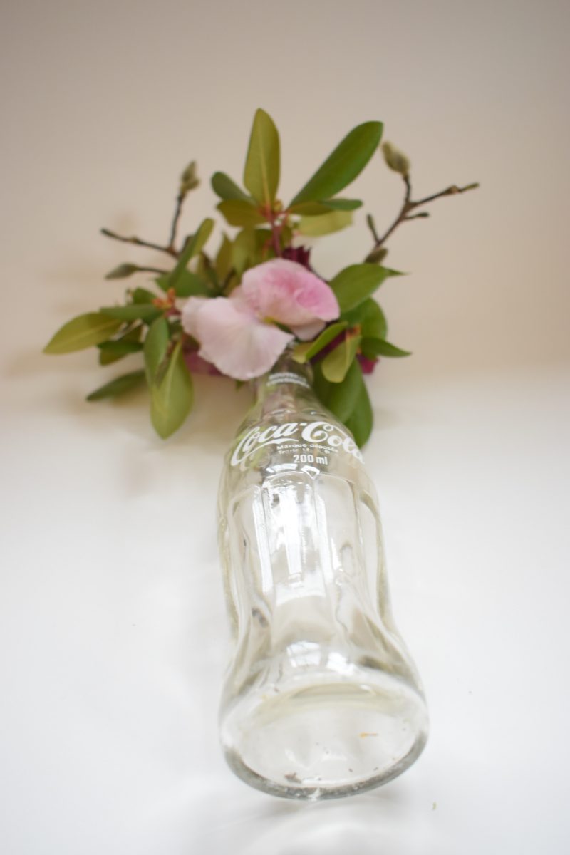 As you can see, it is just some flowers and some greens in a glass coke bottle.
Because the image was recorded from a very awkward angle, it has resulted in some distortions to creep in. Notice that the bottom of the bottle looks way bigger. It is just because the bottom was closer to the camera. On the other hand, the bottle itself and the flowers up top do not look long at all since they were far away from the lens and hence look quite small in the image.
Something similar happens when you take photographs of artworks from a weird angle. Edges seem too long or too short than they actually are.
But have no fear all this is very easily curable. All you have to do is make sure that you shoot from the “correct” position.
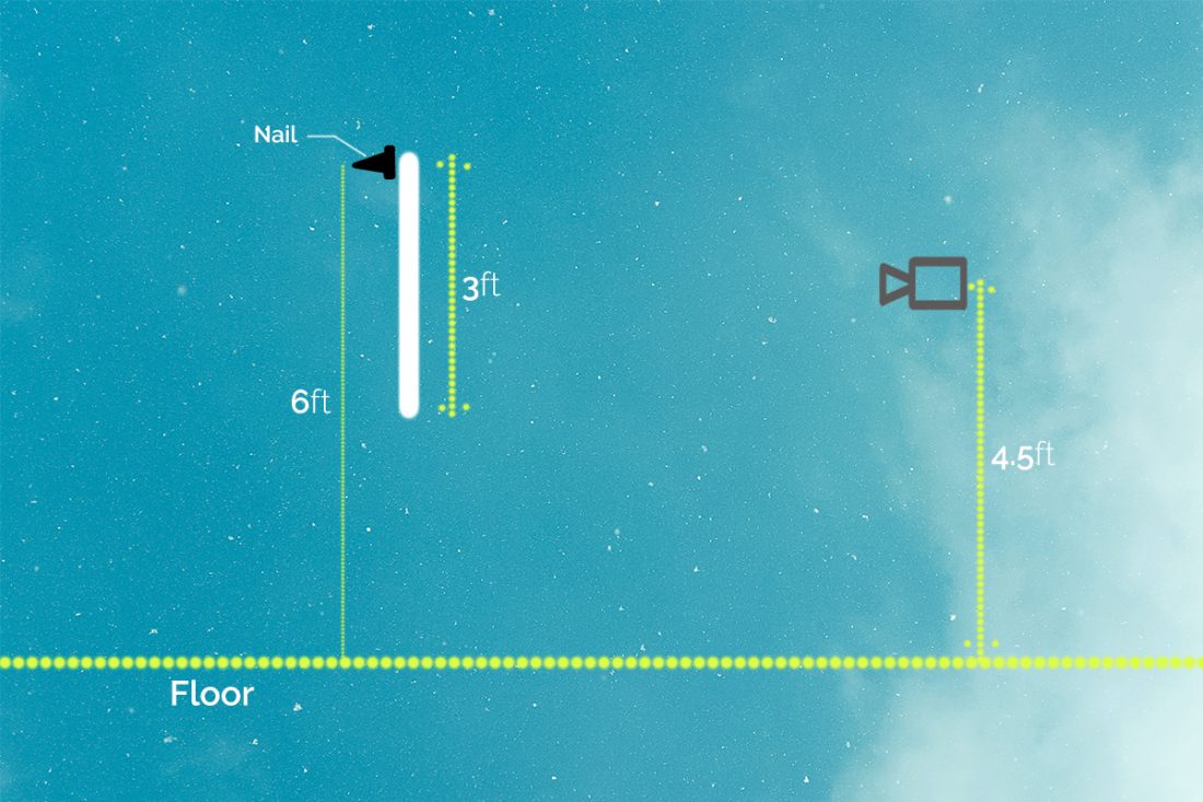
Now, what is the correct position to shoot from?
- Always shoot from a height that is roughly halfway through the artwork. Basically, the centre of the frame and the lens of your camera should be the same height from the floor.If the nail you have hung your artwork from is 6ft from the floor and the length of the canvas is 3ft. You need to shoot from (6ft – 1.5ft) 4.5ft above the floor. The formula for required shooting height is: Nail height from the floor – Length of the artwork/2.

- Keep your camera perpendicular to the canvas. You do not want your camera pointing up, down, or sideways.
Pro tip: Include some of the backgrounds when shooting the image. You can always crop it out later in post-processing.
That’s it for composition.
Lighting The Subject
Photography is nothing but a record of light in a creative manner. Without light, there are no photographs. So it is imperative that we focus on the lighting and make sure that we have the best setup required for the task at hand.
Before you start getting ideas, let me just clear the air and say that you do NOT need to buy expensive lights for this. Our humble Sun will have a lot of light for us to use. I already had a chat with dear Mr. Sun and he has graciously allowed us to do this.
We will discuss artificial lighting solutions but it is just to lay before you all the potential options. You are at full liberty to choose any option you want.
Circling back now.
In our case, we need to photograph a piece of art. It could be a painting, a sculpture, an earthen pot. This is what our subject is.
We light our subject with a very simple objective in mind. Every part of the artwork is illuminated uniformly while preserving and reflecting the actual tones and texture as accurately as possible.
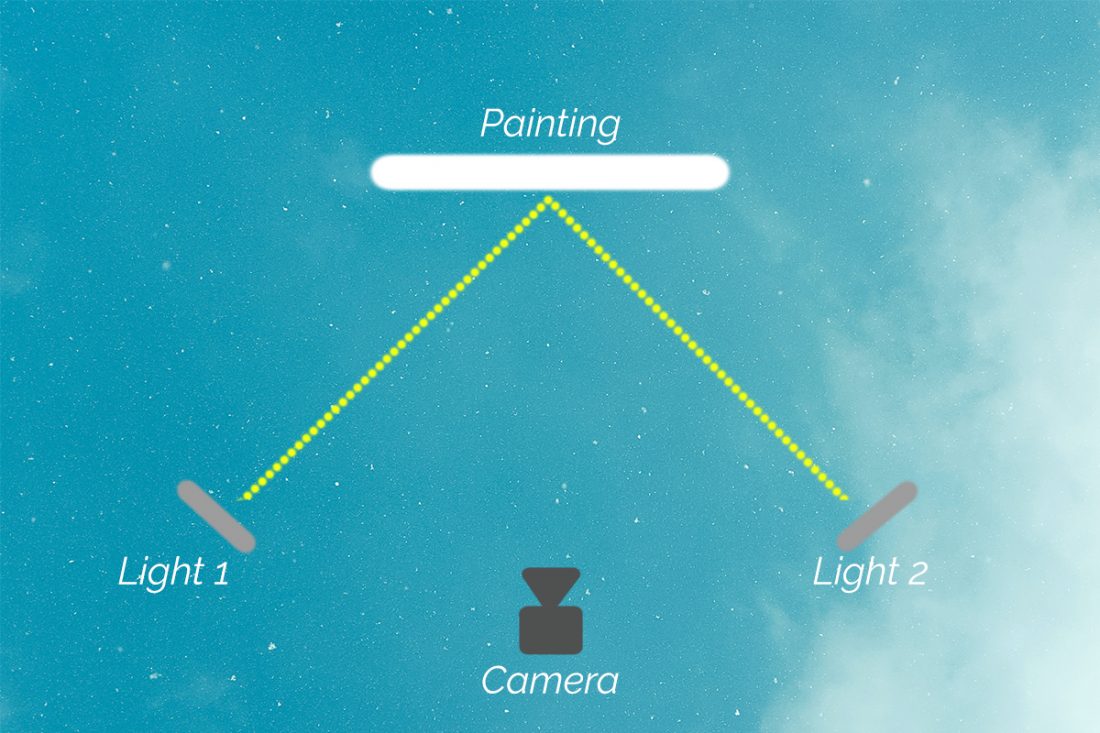
To do this we employ what is called two-point lighting. It is just a fancy way of saying illuminating the artwork using two sources of light.
Natural Light
The Sun is the best possible source of light for all your images.
Yes, shooting with just natural light does have some shortcomings but we can easily overcome them. Let’s talk about them a little later.
Sunlight is what we photographers call pure white light. This basically means that sunlight contains light from all possible wavelengths within the visible light spectrum.
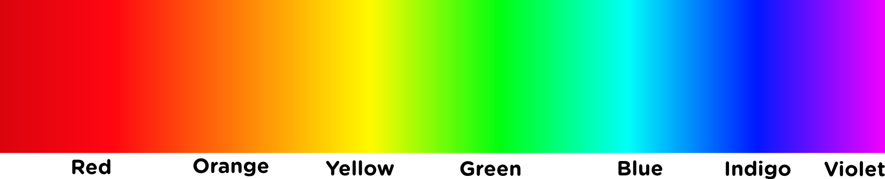
If you do not know what I am talking about here just know that sunlight contains light of every possible color (red, green, blue, etc). Hence it is particularly good at representing the true colors of the art piece you want to shoot.
It is bright enough to dazzle your craft and best of all, it is FREE!
But you have to condition sunlight before you can use it for recording images. It is not as simple as lay down the artwork in the sun and start shooting like crazy.
Let’s go over the process now.
But before everything, NEVER shoot images in direct sunlight. Please do remember this.
The light is extremely hard (forms deep, dark shadows) and makes the subject look really harsh.
You need to soften the light before you can use it.
There are two primary ways of softening any light:
- Pass the light through some medium.
- Reflect it off something.
We will be using both.
Let’s start outlining our setup now.
Find out the brightest window in your house which lets in a ton of light. We are going to shoot next to it.
We do not want to be shooting using direct sunlight, so make sure the artwork is in the shadow. If possible use some thin white curtains over the windows just to help soften the light a little.
Now, we need to position and compose our artwork like we learned a little while back.
The only piece of prop we need here is a big flat piece of white material. Now, this could be a foam core, white printing paper stuck to a cardboard, the cardboard itself painted white. It really doesn’t matter.
Remember I said we will be using a two-point lighting technique? Since we do not have two Suns at our disposal we will have to be a little more creative. To illuminate your artwork from two points we will light one of the sides using natural sunlight and the other side by reflecting the same light. Trust me this works.
Position your artwork next to the window and place the white foam core on the opposite side.
We haven’t yet discussed camera settings yet but once we do, we then have to take some test shots and make sure that both the sides of the artwork is illuminated uniformly. The foam core side may occasionally look slightly darker than the side the sunlight is on. This is easily fixable by just adjusting the distance between the art piece and the white foam core.
If you want to know the underlying reason because of which this happens, read: What Is Inverse Square Law Of Light? | Explained.
Artificial Lights
Like I said before you do not need to spend on artificial lights at all but if you have the budget and need to build a setup that would help speed up the digitizing process you need to splurge on this a little bit.
There aren’t some major investments that you need to make. Just two light sources and some accessories.
Speaking of light sources, for shooting paintings and sculptures which are static and do not move at all, a pair of constant, bright LED lights should work just fine. They come by really cheap these days.
Just make sure that both the lights are identical. There should be no difference in light output, color temperature, shape or size of the light itself. That’s it.
For the rest, we follow the same principle as we did when lighting the artwork using natural sunlight.
Here is all you need to know.
This time around place both the lights on either side of the art piece, roughly at a 45-degree angle (I will explain why).
We used some thin white curtains previously, you can use them here too if you want. The idea is to pass the light through some neutral medium that would diffuse it and make it much softer and easier to work with.
Alternatively, if you have neutral-colored walls (preferably white), you can also bounce the light off the walls. For this, you would have to turn the light away from the artwork towards the walls.
The first method preserves a lot of the light output generated by your light whereas the latter method will result in some loss of light. Not that it would matter a lot in this case.
Now all that remains is for you to take your shot. Monitor a few things initially and making minor adjustments as and when necessary.
Camera Settings
Since this is a studio environment where you, the photographer are in control of most of the elements, the camera settings required for this would be very simple.
For dedicated cameras that have manual controls, set your ISO value to the absolute minimum. In most cases, this would be ISO 100.
ISO (pronounced ‘Eyeso’) is a measure of how sensitive the photographic material is to the incoming light. Since we are using a digital camera, the photographic material is the imaging sensor. The ISO used just determines the degree of sensitivity of the sensor to the light. Higher the number more sensitive it is to light.
Why not use a higher ISO number all the time?
Very simple, it has a drawback. Using a higher ISO value may lead to digital noise. Digital noise is nothing but tiny speckles of inconsistencies or grains, particularly in the darker regions of the image.
For the aperture value, using any value between f/8 and f/11 should give you a nice, clean, sharp image. The depth of field would be large enough to contain any artwork you want to photograph.
Lastly, for the shutter speed, any value which doesn’t give rise to camera shake is good enough. I really recommend using a good, sturdy tripod for this. Generally, 1/60th or 1/100th of a second would be fine.
The ISO value, the aperture value, and the shutter speed, all of it put together should produce a well-exposed image. That is the end goal.
To ensure that the image is not under or overexposed keep a close eye on the camera histogram. Make sure that the bars are NOT TOUCHING either of the left or right walls. If they are, you need to make some changes to the camera settings.
- If the image is too dark (histogram touching left wall): Slow down the shutter speed. Say from 1/100th of a second to 1/60th of a second.
- If the image is too bright (histogram touching the right wall): Hasten up the shutter speed. Say from 1/60th of a second to 1/100th of a second.
The shutter speed value is just indicative of the direction you need to go to make the necessary changes. Please don’t treat them like absolute values which would solve your exposure situation. Keep making the required changes until you get all the bars on the histogram at the centre and NOT touching either of the walls.
Trust only the camera histogram to confirm exposure and not the LCD at the back of the camera. It is not always the best reflection of the image actually recorded.
Post Processing
If you followed all the steps that we just discussed, by now you should have a wonderful image of your artwork ready to rock the world.
Keeping in line with our objective of representing your artwork as accurately as possible the post-processing we are going to subject the image to will be very minimal. Only minor corrections.
So let’s get going.
Color Correction
The first priority we have with respect to any photograph of a piece of art is to exhibit its true tones and color.
We took all possible precautions so as to avoid any unintended color casts and tinge but as they say, you could never be cautious enough. Don’t worry you don’t have to perform a long list of things to make the correction.
Two clicks is all you need.
To set the correct for any slight distortion of color, we would first need a color reference. This is just to tell the editing software what it should consider as the “right” colors.
To make this reference, we need to take an image of a grey card in the same position as your artwork with the same lighting. Basically, after you set up your art piece, clear the background and make sure that the light is all done properly, hold the grey card in front of the art piece and take a shot.
Yes, that is all it takes.
Just remember to keep all other factors such as distance between the camera and the artwork, angle, and position of the light source, etc exactly the same as will be when taking the image of the actual artwork.
The editing software only needs to know what perfect grey looks like in the lighting setup to figure out the correct tones and colors of all other elements in the image.
Further reading: White Balance For Beginners | A Comprehensive Guide.
Every camera body (even from the same manufacturer) has some color bias. So you always need micro-adjustments to ensure the best possible color reproduction. There is no problem with your camera, this is just a standard process.
Crop
Once you are happy with the color and tones of the image. It is time to crop out the background and share your artwork in all its glory.
If you are digitizing your art piece for submitting it for an exhibition or a contest, it is a good idea to read up on how they want the image to be delivered. Some exhibition explicitly want some of the background to remain in the image to help realize the size of the actual art piece.
When cropping try and keep the aspect ratio of the crop same as that of your artwork.
In case you are wondering, the aspect ratio is just a ratio of the length of the image and its breadth. So say if the ration is 3:2, this means that the height of the image and the width of the image compute to a ratio of 3:2.
You can multiply ANY number to BOTH the numbers (3 and 2) to keep the ratio constant. Hence 3ft by 2 ft (multiplying by 1) or 9ft by 6ft (multiplying by 3) all are of the same 3:2 ratio.
If you do not know the ratio your art piece just use the free form crop tool. Crop as close as possible to the edges of the art piece.
Exporting
When you are done with the all the editing within your software of choice, it is time to export the image.
If you are not submitting it to any competitive event and have no personal requirements, export the image as a JPEG with the highest quality possible. This will take up some space on your drive but the quality will be worth it.
For social media usages, such as uploading it to Instagram and Facebook follow the guidelines and best practices they prescribe.
Here is a detailed post about how to uploading the highest possible quality on Instagram: How To Upload High Quality Photographs To Instagram | Optimizing Secrets.
Conclusion
That is it guys, that is all you need to know about how to make digital version of your artwork and share them with the world on the internet.
I hope you have a very good idea about how to embark on this process and build up each of the segments which would serve you for a long long time.
Thank you so much for reading such a long post.
If you have any further questions, please post them below and I will more than happy to answer them for you.
Keep shooting beautiful.